Dailybreak — Marketing SaaS
Redesigned a marketing SaaS platform to turn audience engagement into a measurable brand performance tool.
Engagement issues weren't content-related, they were driven by friction in access and usability.
3→1
profile navigation layers reduced to a single view
-30%
support inquiries through better self-service design
200,000+
monthly users
The Problem
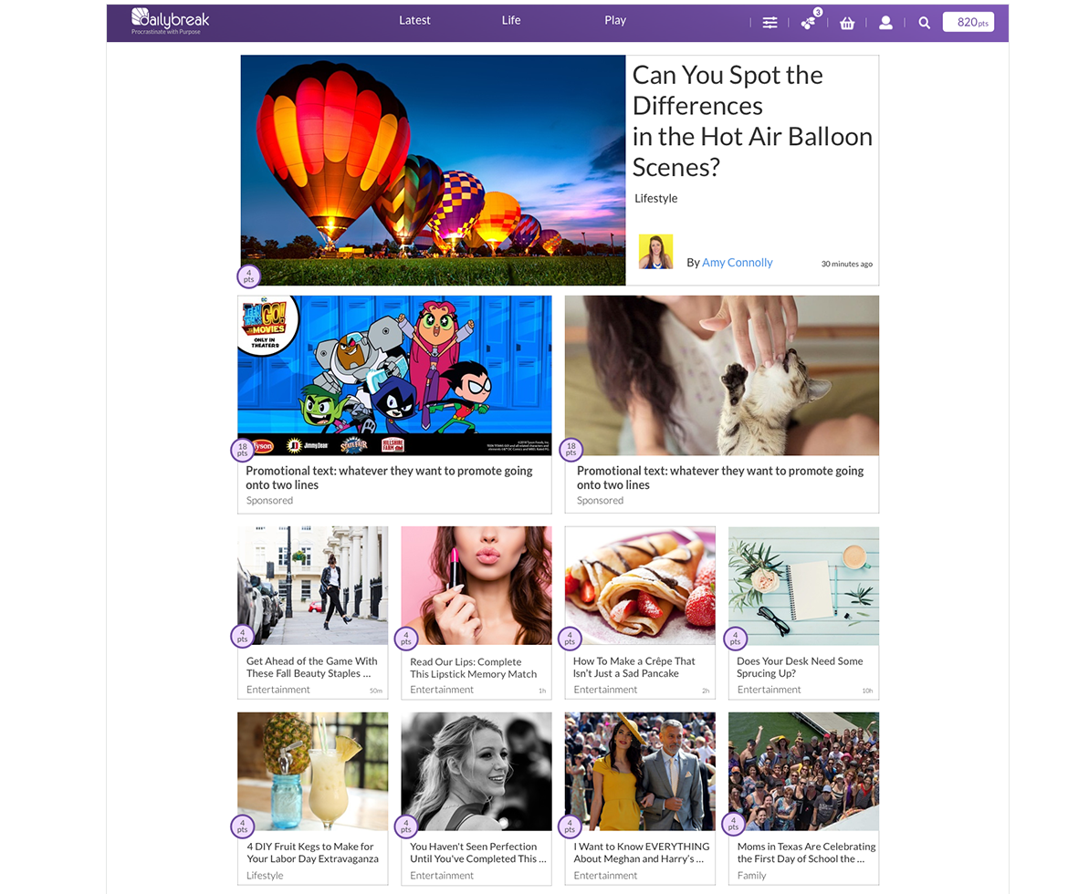
Navigation was deep and difficult to use. Key user information, points, wins, entries was buried. The mobile experience wasn't optimized for the platform's core use case. High support volume was a direct symptom of users not being able to find what they needed.
My Role
- Design Manager within an Agile team
- Led UX strategy, design reviews, and stakeholder alignment
- Oversaw execution and developer handoff
What I Did
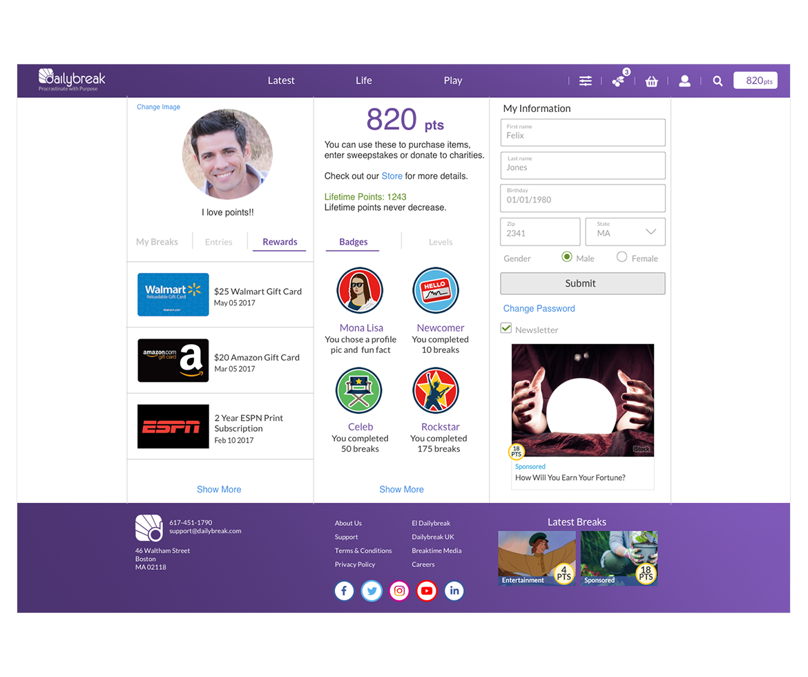
Simplified navigation and surfaced key data
Reduced profile access from 3 navigation layers to a single view. Points, wins, and entries, the data users came for became immediately visible without digging. Lower friction meant higher engagement and lower support volume.
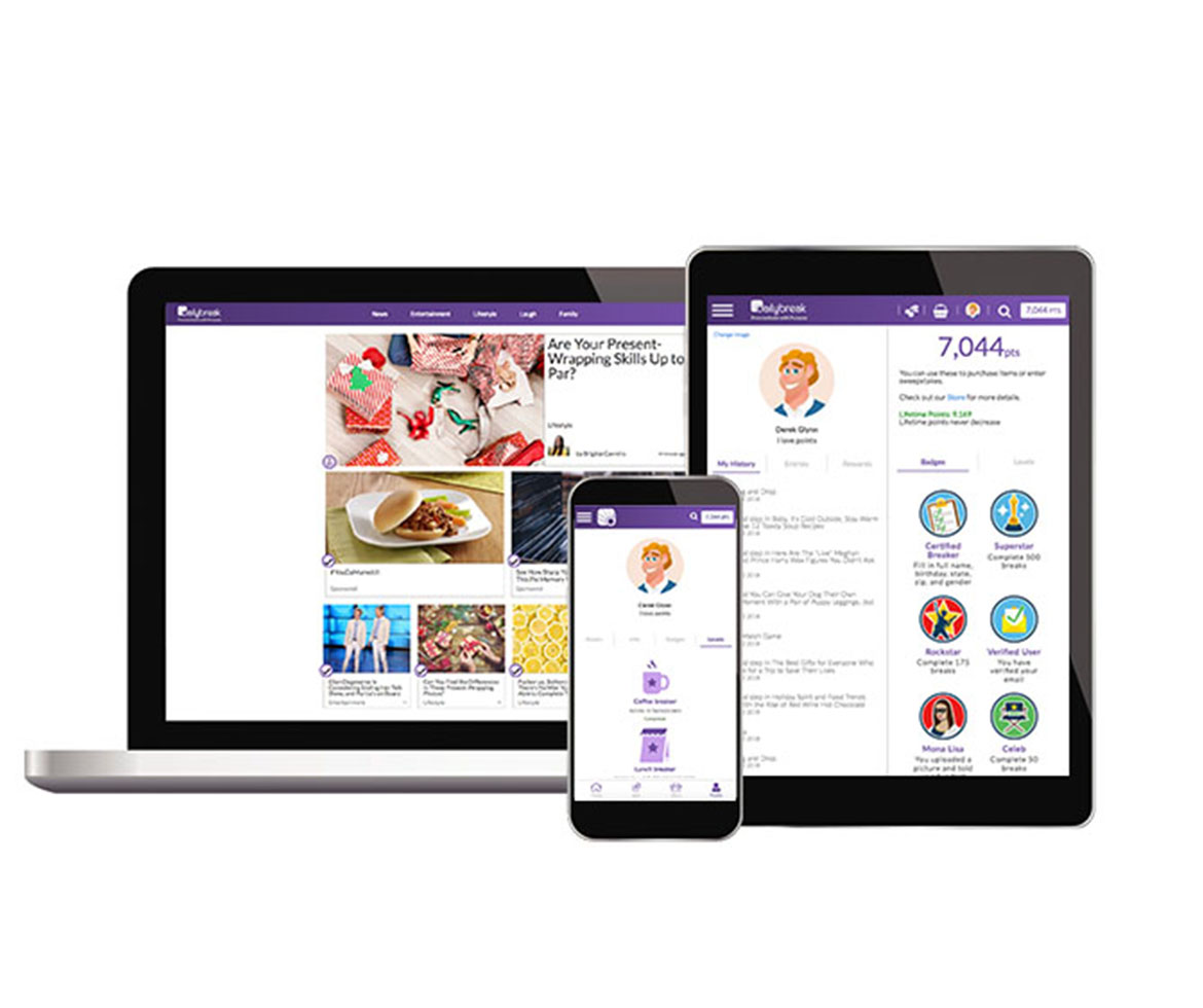
Optimized for mobile-first behavior
Introduced a quick-action toolbar for faster interaction on smaller screens. Responsive design across breakpoints ensured the platform worked for a core audience using it primarily on mobile without sacrificing the desktop experience.
Outcome
Improved ease of use, reduced support requests, and a stronger foundation for retention and personalization. The redesign gave Dailybreak a platform that matched how its core audience actually used it quickly, on mobile, and with minimal friction between intent and action.